A call to action (CTA) is a UX element that prompts the reader to do something. They can appear on a website or on other digital marketing surface areas, like emails. On a website, they can take several forms:
Buttons
Forms
Linked body text
Popups or screen takeovers
Drawers that trigger a pop-up or screen takeover
CTAs fall under two main categories: primary and secondary. A primary CTA prompts the user to take a high-value action like downloading an app or making a purchase. A secondary CTA typically requires less commitment from the user—a link to read a blog article, for example—but it could also be the least favored option of the two choices.
The primary CTA will have a more prominent design, usually through color but also using animation, size, shape, or another hierarchical differentiator.
Types of calls to action
There’s plenty of room to get creative with CTAs, but generally, calls to action fall into these common categories:
Buy
If you run an online store, the most important of all CTAs is the buy button. It should be big and obvious in its purpose. Buy buttons should be at least 44px wide on desktop, according to Web Content Accessibility Guidelines (WCAG). For mobile, CTA buttons need to be large enough for comfortable finger input. The buy button will always be the primary CTA, and can be paired with a secondary action — like adding an item to a wishlist.
Contact sales
“Contact sales,” “Request a demo,” and “Get in touch” are the B2B versions of “buy,” so they should get the same treatment. A contact button should be simple, bold, and easy to find so users don’t need to think twice about requesting more info. In some cases, you might have both a buy and a contact sales button—if the basic version of your software is self-serve but your premium subscription requires you to talk to sales, for instance.
Email or SMS sign up
This is an important CTA for almost all websites. For B2C or B2B businesses, it usually precedes a follow-up from sales or purchase. For media companies, it might be the step before a subscription.
With this CTA, users are prompted to share their contact information (an email or phone number) in exchange for something of value, like a discount code or exclusive content. They’re usually designed as short, embedded forms or buttons that open a pop-up.
Register to attend
These CTAs prompt a visitor to register to attend an event, such as an in-person brand activation or a webinar. Similar to lead generation forms, event sign-ups will capture contact and basic information about the user and trigger a confirmation message with event details.
Browse
“Browse” or “explore” are the softest call to action, inviting site visitors to continue exploring your content or products. You might include buttons to browse product collections, read more about your brand’s story, or learn about pricing tiers. These buttons are navigational by nature, guiding the user to other parts of the site.
Login
This CTA speaks to users who already have an account. It prompts them to enter their credentials and drops them straight into the logged-in experience.
10 call to action examples
The following sites range from classic to creative when it comes to their CTA designs, offering something worth borrowing for just about any site.
Email sign-up: Curated Supply
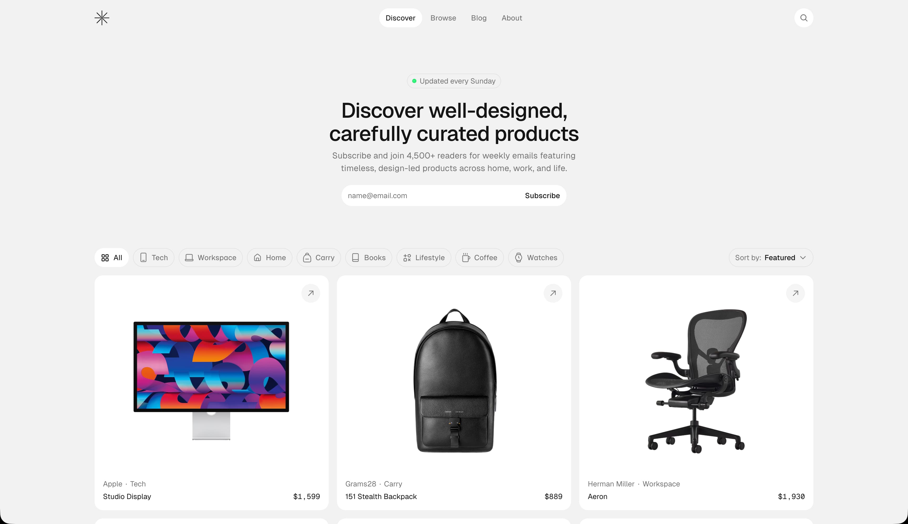
Curated Supply is a curated roundup of high-quality, functional goods. Their most important CTA — email sign-up — appears right at the top of the homepage, impossible to miss and easy to act on. The copy makes it immediately clear what the user is signing up for, and the clean white lozenge design strikes a nice balance between minimalist restraint and a still satisfyingly interactive feel.

Sign up for Framer for free and get 500 free Agent credits every month
Shop button: Temper Studio
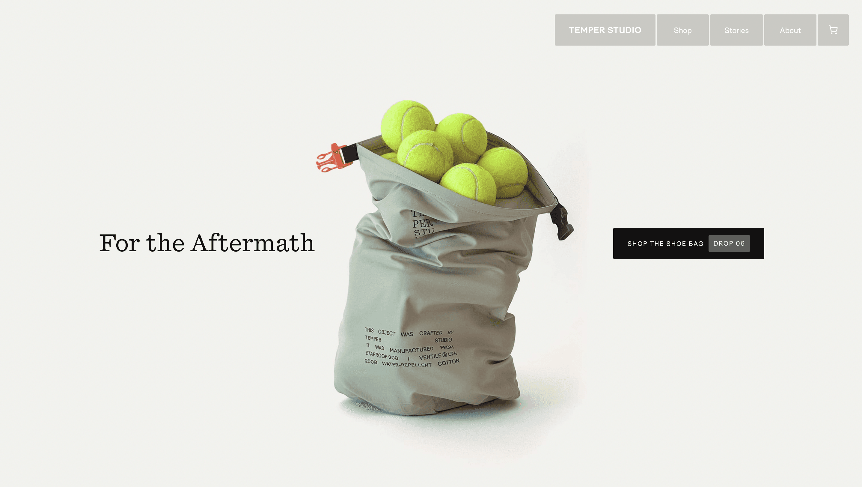
Temper Studio’s hero section includes a simple image of their marquis product from their current product drop—in this case, the shoe bag from their drop #06. The CTA to “shop the shoe bag [Drop 06]” takes the user to the product page. Tying the button copy directly to the product drop creates subtle but real urgency for a more compelling click.
Popover CTA: Deleito
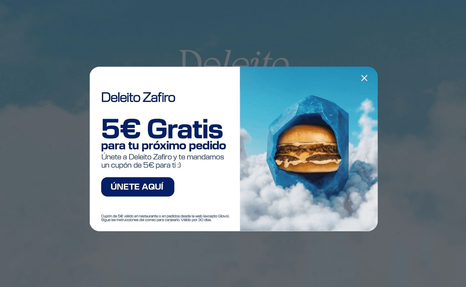
Deleito’s gourmet burger club site uses the tried-and-tested popover CTA, which is a box that requires you to either click on its offer (€5 off your next order if you join now) or click on the X-button to dismiss it.
Bottom bar: Page Break
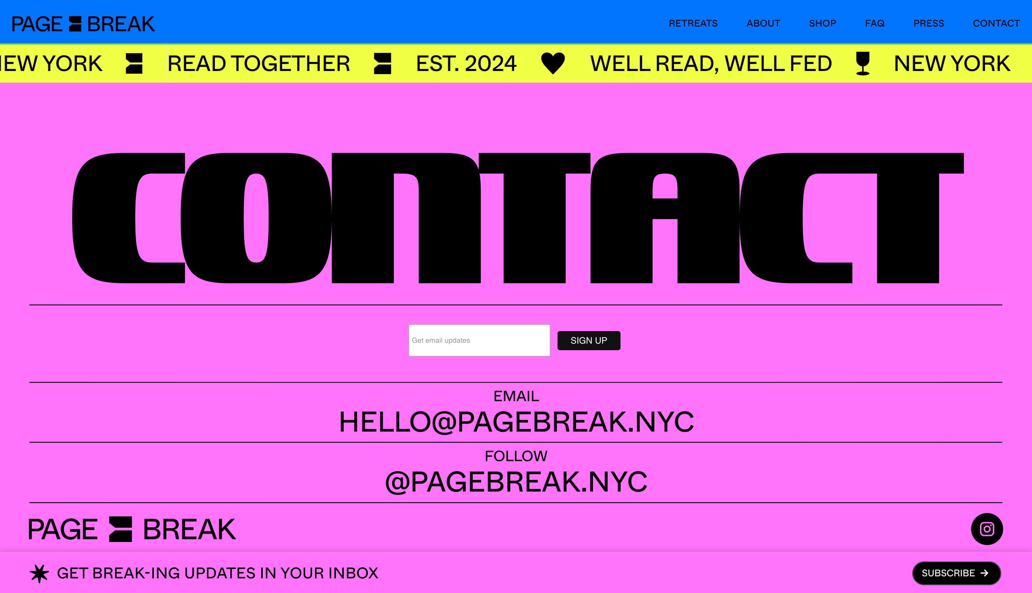
Page Break is a New York-based weekend retreat where attendees read a novel together. Their homepage features two CTAs. The first is a navigational CTA in the hero section that takes users to a detailed page about their next retreat; the second is a sticky banner with an email sign-up CTA anchored to the bottom of the screen.
Viewed together, the subscribe CTA is clearly secondary at first — smaller in size and lower in priority. But as you scroll down to learn more about their offerings, it gradually becomes the primary action.
Borrowed design: tinyPod
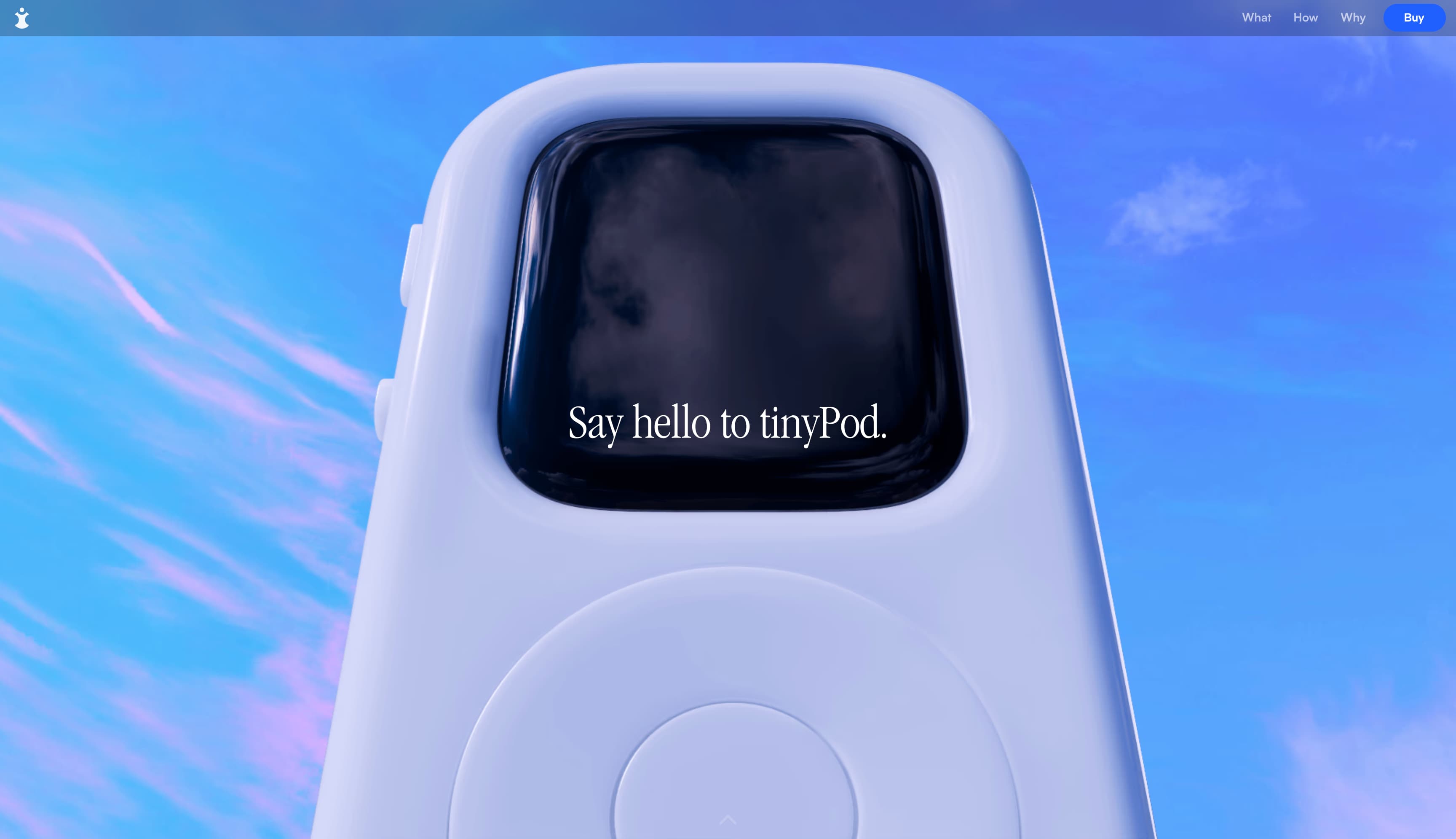
The tinyPod is a miniature case that turns an Apple Watch into a tiny iPod, and their website design cleverly echoes Apple’s store page design using a lozenge-shaped “Buy” CTA button in the same shade of blue that Apple uses in its CTAs. The button stays fixed at the top right of the page, following you no matter how far you scroll.
Cursor animation: Feastie
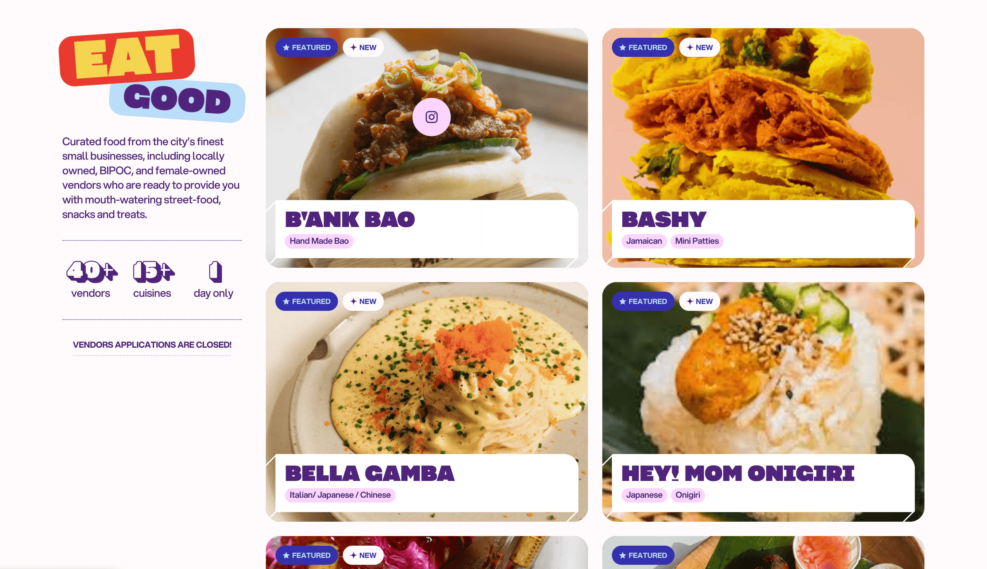
The Feastie food festival site uses a creative cursor animation as a CTA for viewing their participating vendors’ profiles on Instagram. Instead of an Instagram button on each card, the cursor simply transforms into a pink Instagram logo on hover, subtly signaling what happens when you click.
Animation: Punkt
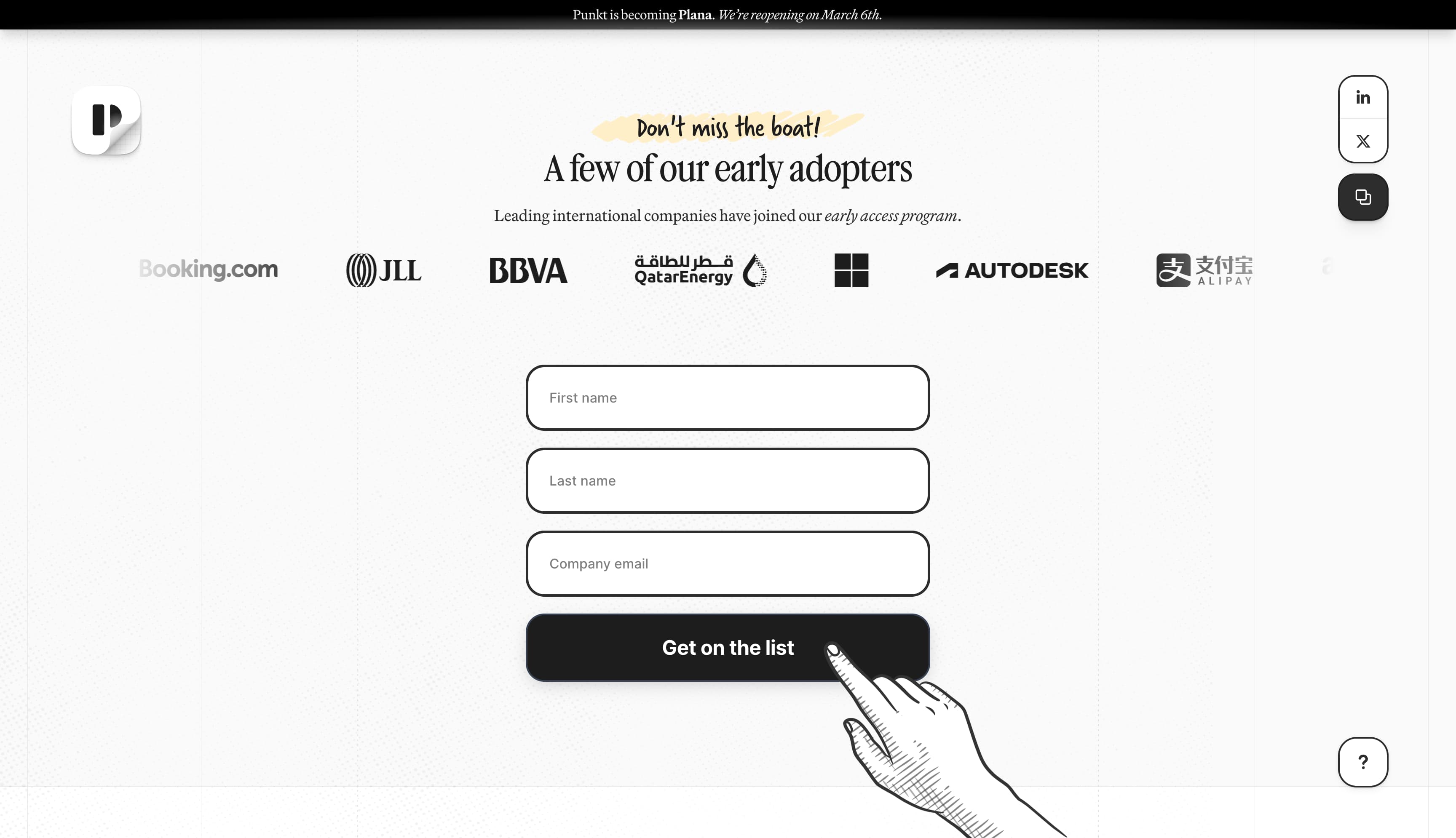
UX design company Punkt’s website uses an irresistible illustration in their email capture form to make their CTA feel irresistible. A scroll animation creates a sense of movement in the hand as visitors arrive on the sign-up button, pulling your eye to the CTA.
Pricing page buttons: Tapdaa
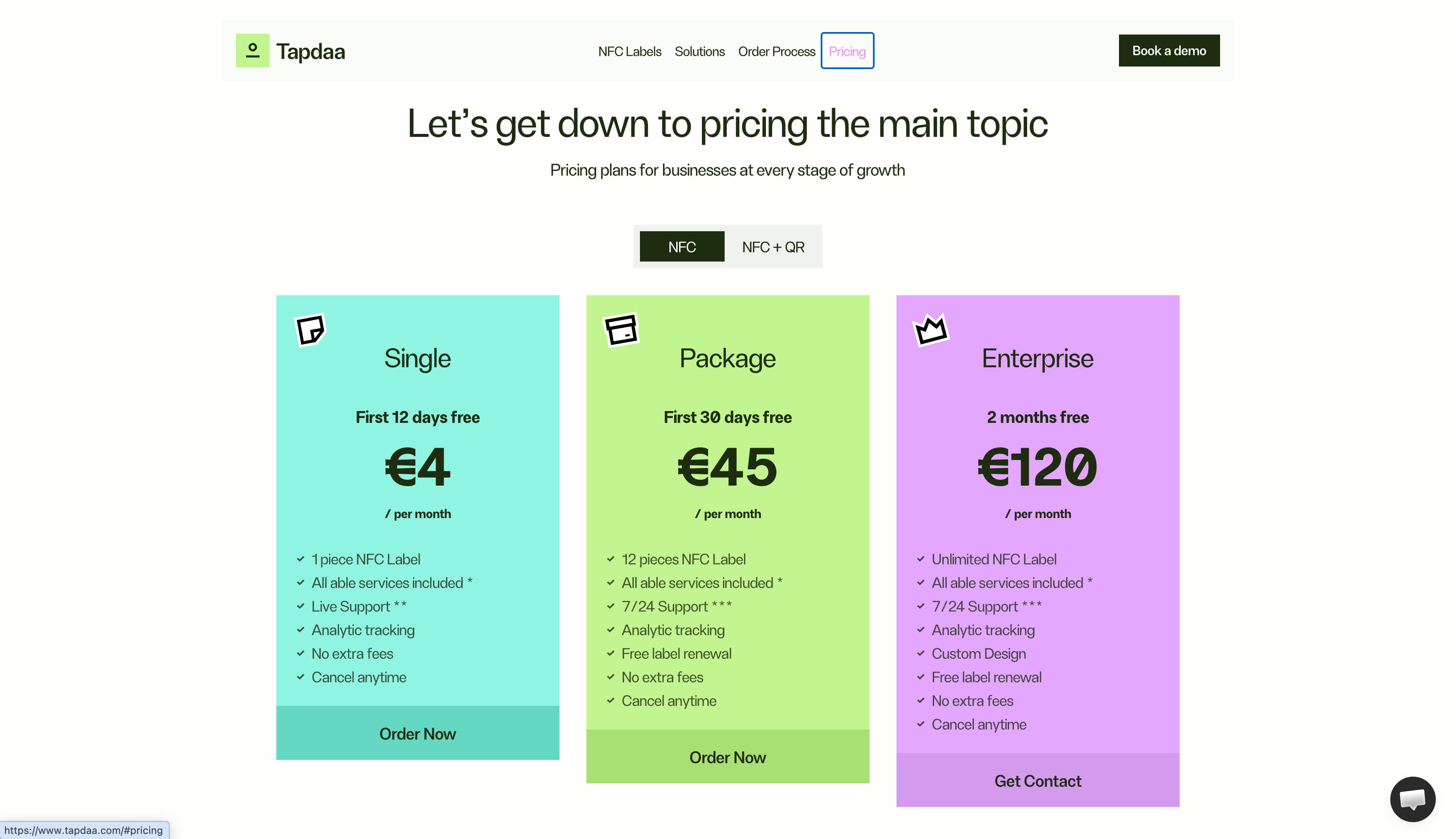
NFC labelmaker Tapdaa combines its price comparison charts with CTA buttons. The three price plans are differentiated by color, the prices are clear, and the listed features show the difference between the plans. The three CTA buttons help you understand what will happen: the first two allow you to place a self-serve order, while the highest tier plan says “Get Contact,” signalling that you have to go through sales.
Branded buttons: Maggie
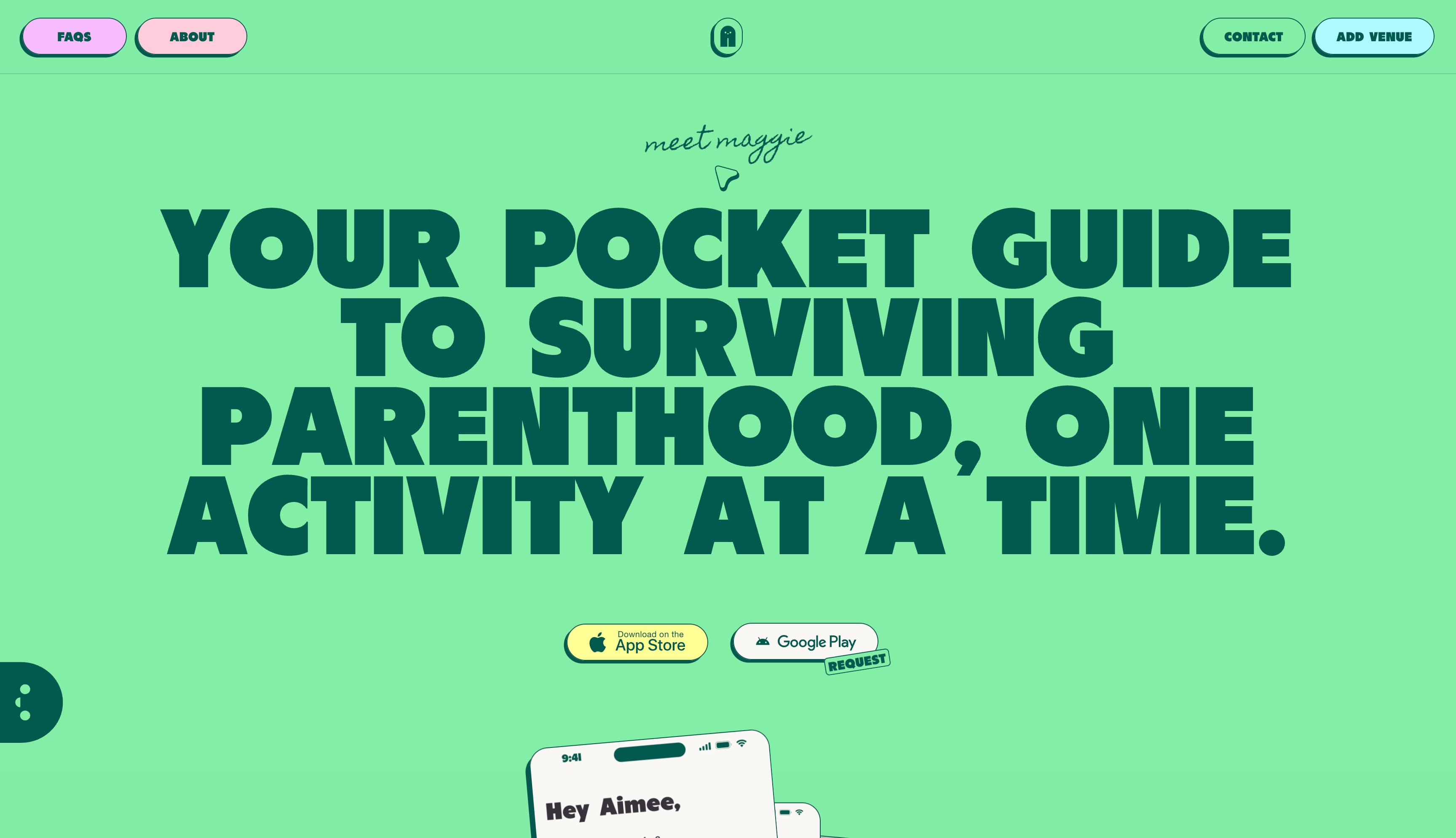
Kids-activity discovery app Maggie puts download CTAs front and center, while layering their brand colors onto the buttons. The Apple App Store download button is the primary CTA, while a button to request an Android app is secondary. The site also infuses their brand color palette on buttons that navigate to their Instagram and TikTok profiles, so that they don’t disrupt the site’s visual branding.
Tips for creating effective calls to action
The key to CTA design is clarity. Visitors should not have to search for CTA buttons. They should be obvious, stand out on the page, and make it clear exactly what they do. Beyond that, you can get creative. Here are tips for creating eye-catching, effective CTAs.
Punch up the copy
Short, direct, and urgent language is the game here. A CTA is prompting people to do something, so use strong action verbs and clear language. Brevity matters too — overly wordy CTAs can cause visitors to lose interest and move on before they ever click.
While clear, functional phrases are tried-and-true, you can also take liberties if your brand style is more voice-y. Website visitors are very familiar with UX conventions now, so you might choose to have fun with non-purchase CTAs. For an email capture CTA, for example, you might opt for button copy like “I want your emails!” rather than a more straightforward “Sign up.”
Choose colors wisely
There’s no one best color, but there are better and worse choices depending on your design. The first priority is alignment with brand style. Consider the colors already at play on the page and choose a strong, contrasting color to make primary CTAs pop. In a colorful design, black and/or white might jump out. Black CTA buttons can be cool and minimal, for example, and can look classy when combined with ample whitespace.
Put forms inline
With email capture—or any other kind of form the user has to fill out—avoid designs that require the user to click through to another page without good reason. If the page design allows it, include the email and other form fields within the CTA module, so that no click is required other than “submit” or “sign up.” Alternatively, an email capture form can pop up, slide, or fade in when the CTA button is clicked.
What 3 elements should always be included in a CTA?
Bold and familiar design. Use rectangles with sharp or rounded corners, contrasting colors, and clear text. You can also use drop shadows to further emphasize its button-ness. While there’s definitely room to play with expectations, a CTA button should look like a CTA button.
Feedback. When a visitor clicks on your CTA, they should get confirmation that something is happening. At the very least, change the button color or the copy to confirm the visitor pressed the button successfully.
Context. A good CTA has support from the elements around it. Stylistically, CTAs should match the tone and language of the rest of the page, but they can also be reinforced by supporting text, images, and other elements that make the click feel compelling and worthwhile.
How should I design for dual CTAs?
Often, you’ll be putting two CTAs together. It might be “Sign up” and “login,” or “Buy now” and “learn more.” Your design should emphasize the primary action, with the secondary option as a fallback. One common pattern for side-by-side CTAs is for the primary to take a bold color while the secondary is an outline with the background color showing through. If the primary and secondary CTAs appear on different parts of the screen rather than side by side, the secondary button may be smaller than the primary.
Create compelling CTAs with Framer
Framer makes compelling CTAs a snap. Framer’s Marketplace offers pre-built sections and components with polished CTA patterns. You can use Framer’s animations to bring your CTAs to life with micro-interactions that respond to hover, click, or scroll—no custom code required. And Framer’s responsive controls ensure CTAs adapt seamlessly across every breakpoint without ever breaking the visual hierarchy.
Want to test a conventional CTA against a more unconventional idea? Framer’s built-in testing features let you A/B test your CTAs directly from the CMS — no third-party tool required.